Brad Wardell's views about technology, politics, religion, world affairs, and all sorts of politically incorrect topics.

For this journal, I’m going to, in story form, give you a guided tour of Escalation.


Background..

Escalation is the first expansion pack to Stardock’s massive-scale RTS, Ashes of the Singularity.  It is sold as a stand-alone expansion with its pricing determined based on whether you already have Ashes of the Singularity or not.  To learn more, visit www.ashesofthesingularity.com.


The year is 2180…

The human race is at an inflection point.  The technological singularity has given humans capabilities that a person form the 21st century could scarcely imagine.  A handful of humans have made the transition to becoming “Post-Humans”, beings whose very consciousness is spread across multiple worlds thanks to the breakthrough technology of “Quantum Streaming” which allows for instant communication across great distances.

The largest group of these Post-Humans have formed a group called the Post-Human Coalition, PHC.  Its goal is to map out suitable worlds to expand to ensure that no individual Post-Human comes to dominate the rest.  Unfortunately, some of the Post-Humans have taken a different path. These renegades, still ostensibly PHC members, look to claim worlds for themselves. They fight each other and they fight the PHC itself. 

Into this turmoil has come a new enemy: The Substrate. The strong AI that has evolved along side the Post-Humans has determined that the PHC and its members must be annihilated before their recklessness jeopardizes all.

The planet, Elysium

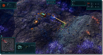
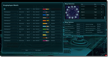
Escalation doubles the number of playable slots from 6 to 12.  Today on the planet Elysium, 12 factions will battle against each other for control of the world.  Elysium is a crystaline world, a planet class new to Escalation.
 

image

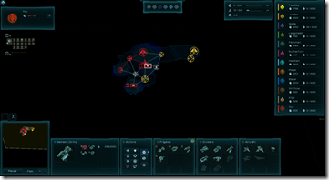
Setting up with 12 players.


image

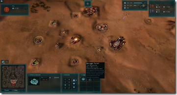
Crystaline worlds have a violet hue to them.


image

Escalation adds some new very low-tier defenses that can be upgraded.


image

and further out

image

and further

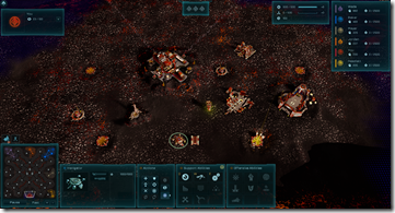
Meanwhile on Pollux


image

The new PHC Instigator is constructed at the Nexus. It is expensive but is quite effective at taking lightly defended regions.
 

image

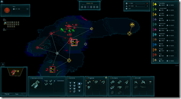
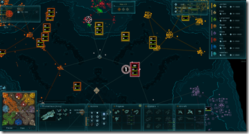
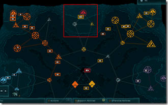
late game, it remains easy to manage vast forces across the world thanks to the strategic zoom.
 

image

From up here it seems peaceful. Sure, I’m red but having an enemy army in my base is so less scary from space. Winking smile


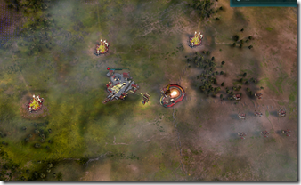
Deneb Revisited

image

Weather


More to come..


Comments (Page 1)
2 Pages1 2 
on Oct 20, 2016

Am I to interpret the top few images as being a change up to how the two factions develop their bases? Because that would be so cool.

on Oct 20, 2016

Can i know who was the icons design choice in middle and full Zoom and wy?

The rest its really good i like fantastic work.

on Oct 21, 2016

I must be the only one who doesn't use strategic zoom.


Please.Please add;

- Hotkeys for Pause + Resume. (of construction)

- Hotkeys for Production buildings.


Q: Does escalation come with all previously released single player scenarios?


on Oct 21, 2016

The buildings look like... like they're floating above the surface. Is the top layer of the crystalline worlds supposed to be opaque?

-pac

on Oct 21, 2016

Not to offend anybody, but to be honest with you, the terrain texture looks rather shit.  Hope thats not its highest possible resolution, cause its fairly blurry compared to the 3D models of buildings and units, which are pretty sharp otherwise. Its difficult to put into words, but the it looks weird overall and just not right - unlike sandy and grassy landscapes from the original game.

on Oct 21, 2016

Timmaigh

Not to offend anybody, but to be honest with you, the terrain texture looks rather shit.  Hope thats not its highest possible resolution, cause its fairly blurry compared to the 3D models of buildings and units, which are pretty sharp otherwise. Its difficult to put into words, but the it looks weird overall and just not right - unlike sandy and grassy landscapes from the original game.

Which one?  

Some of the shots are taken at high resolution, others not.

on Oct 21, 2016

Image 10 and image 12 look like something out of 1997...

on Oct 21, 2016

Frogboy


Quoting Timmaigh,

Not to offend anybody, but to be honest with you, the terrain texture looks rather shit.  Hope thats not its highest possible resolution, cause its fairly blurry compared to the 3D models of buildings and units, which are pretty sharp otherwise. Its difficult to put into words, but the it looks weird overall and just not right - unlike sandy and grassy landscapes from the original game.


Which one?  

Some of the shots are taken at high resolution, others not.


All of them, its not down to screenshot resolution. On all of them the surface just looks like having lower res texture than other stuff, it literally seems like you set its texture quality lower (if that was possible i mean).

The later added screens of volcanic surface are not great either, sorry. That texture seems visually way too aggressive with the little repeating pattern and will IMO make it hard to spot units against it. 

Safe to say, i am not fan of either of these new surfaces, sorry. I am just picky about aesthetics in general. 

on Oct 21, 2016

Timmaigh


Quoting Frogboy,


Quoting Timmaigh,


Not to offend anybody, but to be honest with you, the terrain texture looks rather shit.  Hope thats not its highest possible resolution, cause its fairly blurry compared to the 3D models of buildings and units, which are pretty sharp otherwise. Its difficult to put into words, but the it looks weird overall and just not right - unlike sandy and grassy landscapes from the original game.


Which one?  

Some of the shots are taken at high resolution, others not.


All of them, its not down to screenshot resolution. On all of them the surface just looks like having lower res texture than other stuff, it literally seems like you set its texture quality lower (if that was possible i mean).

The later added screens of volcanic surface are not great either, sorry. That texture seems visually way too aggressive with the little repeating pattern and will IMO make it hard to spot units against it. 

Safe to say, i am not fan of either of these new surfaces, sorry. I am just picky about aesthetics in general. 


ok.

on Oct 21, 2016

I've updated a few months f the images with higher resoluti N ones. That any better?

on Oct 21, 2016

Looking a lot better, in my opinion. The volcano environment still looks a little strange, but all in all, pretty good.

I do hope the weather effects will look more intense than what can be seen here.

-pac

on Oct 22, 2016

Mmm, exciting shiny new graphics!   Looking forward to playing the new maps.

The weather looks interesting. Will there be snow storms as well?

on Oct 22, 2016

More importantly, will affect gameplay, or its just there for looks? 

On topic of surface textures, i reserve my judgement for later, when i get a chance to play the game myself, as its not the same as judging from screenshots.

on Oct 22, 2016

So cool.

on Oct 22, 2016

If the lights refract then the fog effect should be pretty cool around a battle.

2 Pages1 2